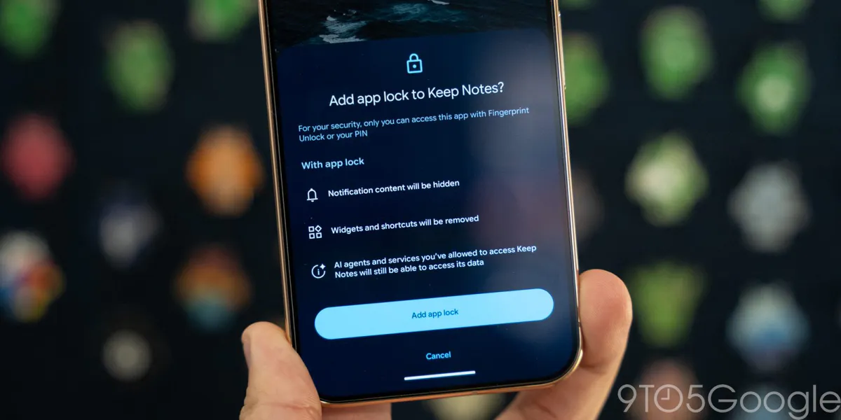
Google completes gradient icon rollout for Messages, Contacts and Phone
The visual update leaves the apps’ familiar symbols intact. A broader Messages homepage redesign remains in beta.
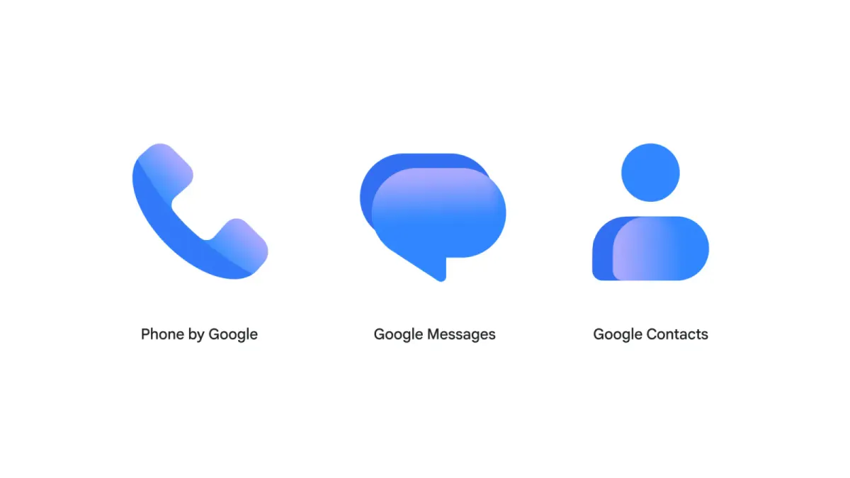
Google has finished introducing gradient-style icons across its three communication apps, with Messages and Contacts completing the rollout. The updated icons reached full availability two weeks after they were announced.
The designs use a lighter blue and a gradient effect while retaining each app’s existing symbol. Contacts keeps its head-and-body silhouette, Messages uses overlapping speech bubbles, and Phone retains a handset. The symbols are slightly larger, taking up more of their circular backgrounds.
Contacts was the final Android app in the group to receive the new icon, through version 4.92.26.x. The updated Phone by Google icon had already reached users on the stable channel.
For Messages, the logo update arrived without any other changes to the SMS/RCS app in the same rollout. Its larger homepage redesign has not moved beyond the beta channel.