Apple Music brings Liquid Glass design to Android in version 7.0
The update changes the app icon, introduces blue accents and reworks navigation, artist pages and library controls.
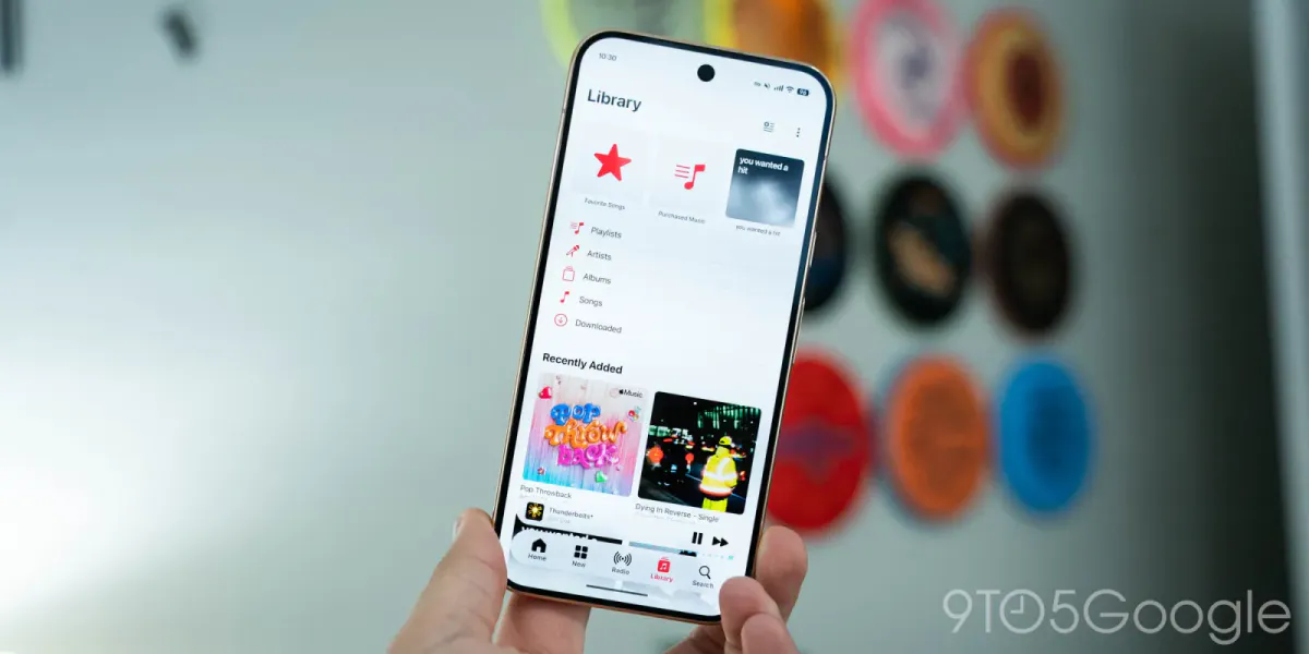
Apple Music’s Android app is receiving version 7.0 through the Play Store after a month of beta testing, bringing the service’s Liquid Glass redesign to a wide rollout.
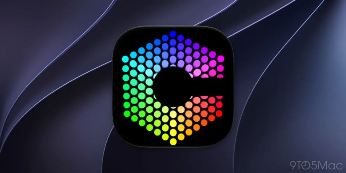
The refreshed icon drops its red background and uses a black or white musical note according to the device’s theme. Blue replaces the app’s previous accent color, while the layout extends to the edges of Android’s system status and navigation bars.
Navigation now uses a floating bottom bar with limited translucency, allowing underlying colors to remain visible. The mini-player has a similar appearance but sits separately from the bar. Unlike the iOS version, the Android navigation bar does not shrink when users scroll.
Other changes reorganize controls across the app. Page titles share a line with overflow menus, and three-dot icons sit inside circles rather than appearing in red. In the Library tab, the three-dot menu now contains the Edit Pins and Edit Categories options.
Artist pages adopt backgrounds based on their cover images, with a prominent play button, an information page and sharing controls at the upper right. Settings are regrouped, while Now Playing has no major changes. Under the recently adopted numbering system aligned with iOS, Android version 7.0 corresponds to iOS 27.